Sunday, April 29, 2012

CORAL SHOWDOWN.


L-R: Wet n Wild Blazed, Sinful Colors Island Coral, Butter London Trout Pout, Sally Hansen Coral Fever

I have a coral problem. They speak to my heart and are the perfect shade for my skin tone regardless of the season. I was going through my collection and noticed these four shades look super similar, so I swatched them on a nail wheel to see how they all compare to Trout Pout..and ... here we are!


WnW Blazed is more peach toned and darker than Trout Pout. Sally Hansen Coral Fever is also darker, but more pink toned.

Now, Sinful Colors Island Coral is a bit thin. That's three coats. I obviously didn't wait for any of these layers to dry so it looks like my nail wheel is melting. ANYWAY! Sinful Colors Island Coral, in my opinion, is a dupe for Butter London Trout Pout. Trout Pout has a much better formula. It's a bit thicker. That's two coats in the photo. But, ignoring the bald spots in Island Coral and the colors aren't that discernible!

If you want Trout Pout but don't to shell out $14 for it, go buy Sinful Colors Island Coral for .99 cents this week (regularly 1.99 at Walgreen's). The formula is different but the color is the same! I'm sitting here with my nail wheel right up to my face and I cannot see a difference.

Thoughts?

Intergalactic planetary, planetary intergalactic

I tried my hand at galaxy nails last night and can't say I was terribly successful...but it wasn't a huge fail, either. The pointer finger is the only one that really turned out so I took a separate photo of that one. I'm definitely going to be putting these back on the "try again" list. I didn't have a toothpick for my stars so they came out more like angry comets.

I used Sally Hansen Black Diamonds for my base and sponged on Zoya Creamy and Gia, Sinful Colors Snow me White, Nail Junkie, and Hottie, and Sally Hansen Loves me Not from the new 2012 Spring Runway Collection (WHICH IS AMAZING and I will be showing you this color alone later this week)


MEH. I did both hands but I can't really photograph both hands that well.

Saturday, April 28, 2012

Zoya Julieannie - take II

Zoya Julieanne was one of the first few posts I did. The photo was really lacking though considering I took the photo in my kitchen, so I decided to try again. This photo isn't so hot, either. I took about 50 of them and only one came out.

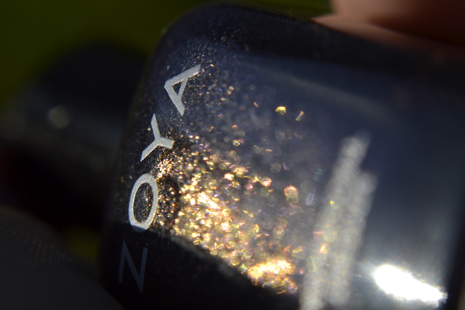
Julieanne is from the 2010 Wicked collection. It's a very deep, blackened, jewel-toned blue-based purple with lavender flakes of glitter. It's STUNNING. Come on, I used four adjectives just to describe what shade of purple it is! In the bottle it shows this beautiful gold-glitter but that doesn't resonate on the nail at all, which is a huge bummer. Imagine how much more awesome this polish would be if the gold showed up? It's even described on the website as being a peachy-gold duochrome but...it's not. It's just a gorgeous deep purple glitter.

This is two coats of Julieanne, you really don't need more than two!

If you like Julieanne, you can buy her here.